Support

How to navigate your Workspace Dashboard
Chris Jones takes us through how to navigate your Workspace Dashboard.
Transcript:
Chris: Hi, in this video, I'm going to be showing you what your workspace level dashboard looks like and what to expect to see. Your workspace will be something like your business unit or sector or region that sits within your organization. In this dashboard, you'll see four key indicators at the top.
These are the number of licenses that sit within this workspace, the number of reviews that have been sent within this workspace, and then your average MPS and Pulse Index scores throughout that workspace. To filter by date or potentially by account manager or client, select one of the two filters at the top, and you can filter the data to specifically see these needs. Below is a list of all the clients that sit within this workspace and the last review that has been sent to that workspace.
You'll see here the client name, the number of reviews that have been sent within that client, the last review. If there is a dropdown, you'll be able to see a different review as well that has been sent recently, the number of recipients that received that review and the percentage of users that read the review, and then also the average Pulse Index and MPS score for that review specifically. If you want to view the review itself or review the analytics of it, select the three dots on the right and select View Review or View Analytics.
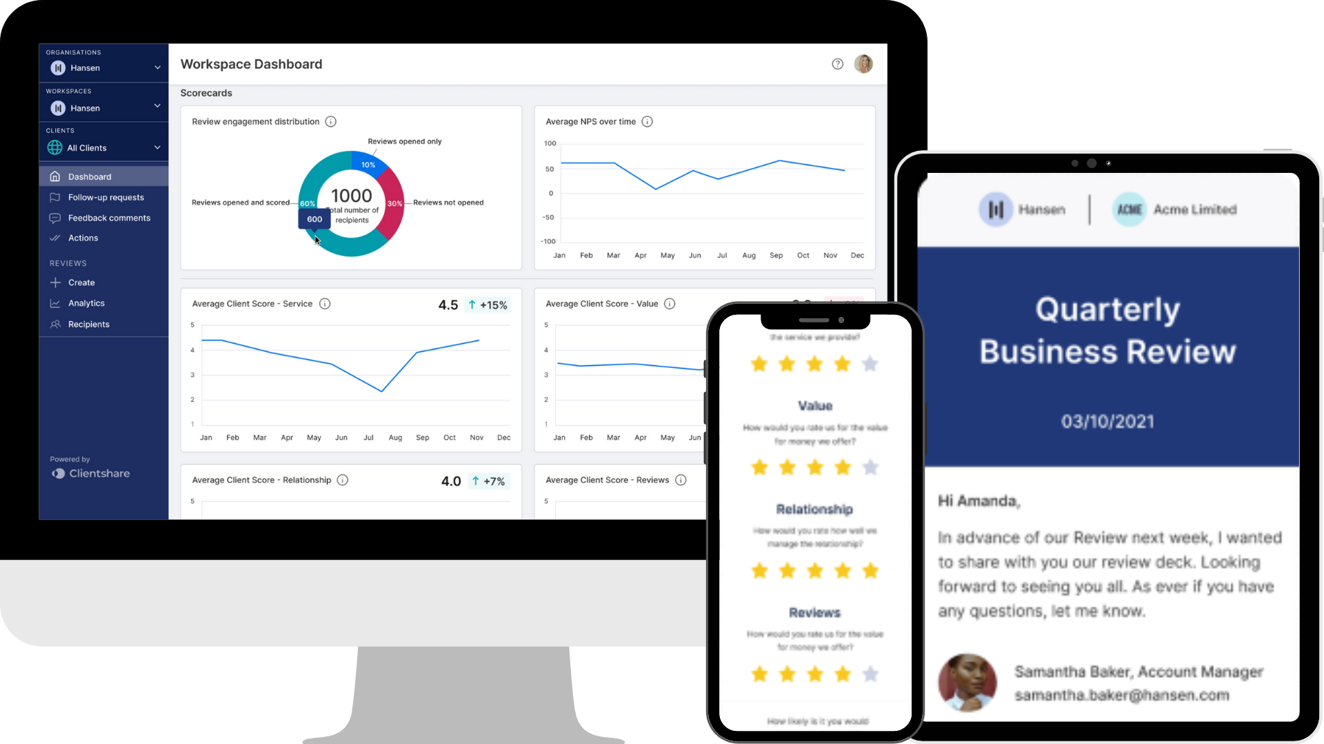
Then below, you'll see your scorecards. These will be populated by your Pulse Index by client scores and Pulse Index by account manager scores. When your data is available, you'll be able to hover over each point as well to filter by client and also by account manager.
You'll also notice that you'll select your Pulse Index questions. These may change over time, so you want to make sure you've got the most present scores available so that it shows the correct information. Then you have your Pulse Index and your Net Promoter Score averages across each month for that specific workspace.
And at the bottom, you have your Satisfaction Score, which is an average of each of the four questions you provide within your reviews. Finally, you have your most recent feedback comments that have been left within reviews within this workspace, and also, again, the average for each of the four questions you have. And by hovering over the stars, you'll be able to see the exact score for those.
If you have any questions about how to use your workspace-level dashboard, please contact support at myclientshare.com. And for this workspace-level dashboard to be available, you must be either an owner, an admin, or a senior manager who's been assigned access to this workspace. Thanks for listening.
Read more:
How to edit reviews
NPS and CSAT improve customer retention
Improve your business reviews
Not yet a Clientshare customer?
Learn more about Clientshare and our software solutions for service providers here or request a demo.

Download our research whitepaper, 'The QBR Frustration'
We interviewed 100 senior leaders of B2B enterprises across the Logistics, FM, Contract Catering, IT, RPO and BPO sectors from the UK and US. The research reveals the failures of today's QBRs and highlights the urgent need for better business conversations. Learn more about where you can improve your QBRs to protect your margin and grow relationships with buyers today.

.jpg?width=300&height=169&name=YouTube%20Thumbnails%20(12).jpg)

